
I Built a Regression Model on a High School’s Admissions Data. Here’s What it Predicts.
Henry Anderson • June 2026 • 14 minute read
Eight universities. About 600 anonymized applicants from a single local high school. One dataset, three numerical features: GPA, SAT or ACT, and whether you applied early. Below is what those features look like, plotted out by school, with accepted students in blue and not-accepted students marked with a red X. The rest of this post is an attempt to make sense of these dots.
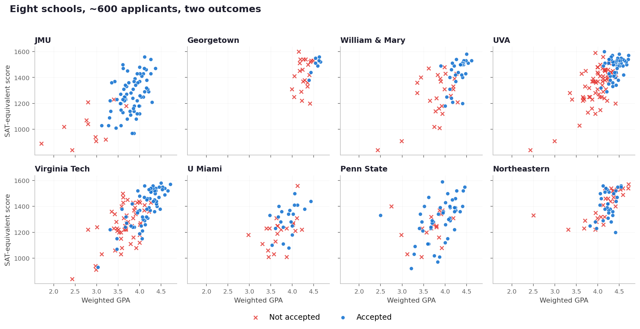
Each panel shows one school’s applicants from this dataset. Notice how cleanly the blue dots separate from the red X’s in some schools (JMU, Georgetown), and how scrambled they are in others (Penn State, Northeastern). That visual gap is the whole story.
“One important caveat before we go any further. This is a quantitative exercise on a small sample of one school’s applicants. The model can only see three numbers per applicant: GPA, test score, and whether they applied early. It cannot see essays, recommendations, interviews, extracurriculars, demonstrated interest, institutional priorities, or any of the things admissions officers actually weigh during a holistic review.Nothing in this post should be read as a verdict on a school’s admissions practices. When I describe a “pattern” at a school, I mean a pattern that shows up in three numerical features, not a judgment about how that school evaluates applicants. The most interesting finding in the data, in fact, is how much of admissions cannot be explained by the numbers at all.”
Why I did this
I’m a high school student in Northern Virginia, and I’ve been curious for a while now about how college admissions actually works under the hood. Admissions officers talk about “holistic review.” College counselors talk about “the whole package.” Everyone agrees that GPA and test scores matter, and everyone agrees that they aren’t the whole story. But nobody can ever tell you, in concrete terms, how much they matter at any given school.
That bothered me. I’m headed for a quantitative track in college, hopefully studying something at the intersection of data and finance, and the idea that one of the most consequential decisions a teenager faces gets made by a process nobody can describe in measurable terms felt like a problem worth attacking. So when I got access to several years of anonymized applicant records from a local high school, with GPA, SAT, ACT, application timing, and outcome, I figured I could answer the question with math instead of vibes.
The dataset has about 600 applicants spread across eight universities: UVA, Virginia Tech, JMU, Penn State, Northeastern, Georgetown, the University of Miami, and William & Mary. Every record was stripped of names and any identifying information before I touched it. Any specific applicant profiles you see in this post are illustrative composites, not real people.
I also wanted to give people a little more clarity into what this kind of model can and can’t do, so I built an interactive simulator that runs the actual fitted models in the browser. It’s at the very bottom of the post if you want to skip ahead and play with it. Just keep in mind that whatever number it spits out is the model’s prediction based on three features, not a prediction about you.
The big finding, in one chart
Once you fit a model to each school, here’s what comes out when you ask the same question for each one: how much of an admissions decision can be explained by GPA, test scores, and whether you applied early?
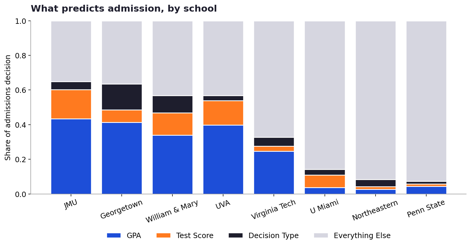
Each bar shows how much of an admissions decision at that school is statistically explained by GPA, test score, and decision type (early vs. regular). The gray block is everything the numbers can’t explain: essays, extracurriculars, recommendations, and the intangibles of holistic review.
The headline: schools fall into three pretty distinct groups.
Numbers-driven JMU, Georgetown, UVA, and William & Mary. At these four schools, GPA, scores, and timing explain 57 to 65% of the decision. If you know an applicant’s numbers, you can predict their outcome correctly about 79 to 93% of the time.
In between Virginia Tech. The numbers explain about a third of the outcome. The other two-thirds is something else.
Holistic Penn State, Northeastern, and U Miami. The numbers explain less than 15% of the decision. At Northeastern in particular, a model based purely on transcripts performs barely better than flipping a coin.
Read that gray block as “the part of admissions that isn’t about your transcript.” At a school like Penn State or Northeastern, it’s more than 90%. That’s a huge number, and it means that whatever holistic review actually does, it’s doing most of the work.
“The big idea: Some schools’ outcomes are mostly explained by the numbers in this dataset. Some aren’t. The trick is figuring out which is which, because the right strategy for one is the wrong strategy for the other.”
How the model works (the friendly version)
The tool I used is called logistic regression. The name sounds intimidating but the idea is simple. It’s a function that takes a few numbers about you (GPA, SAT, early or regular) and spits out a probability that you’ll be admitted.
Think of it like this. You have a bunch of dots on a graph: blue dots for students who got in, red X’s for students who didn’t. Logistic regression draws the best possible line through the cloud. The line where, on one side, most of the dots are blue, and on the other side, most of the dots are X’s. Anyone above the line is a likely admit. Anyone below it is a likely deny. The further from the line you are, the more confident the model gets.
Here’s what that actually looks like for two of the schools, side by side, with the model’s probability shaded in:
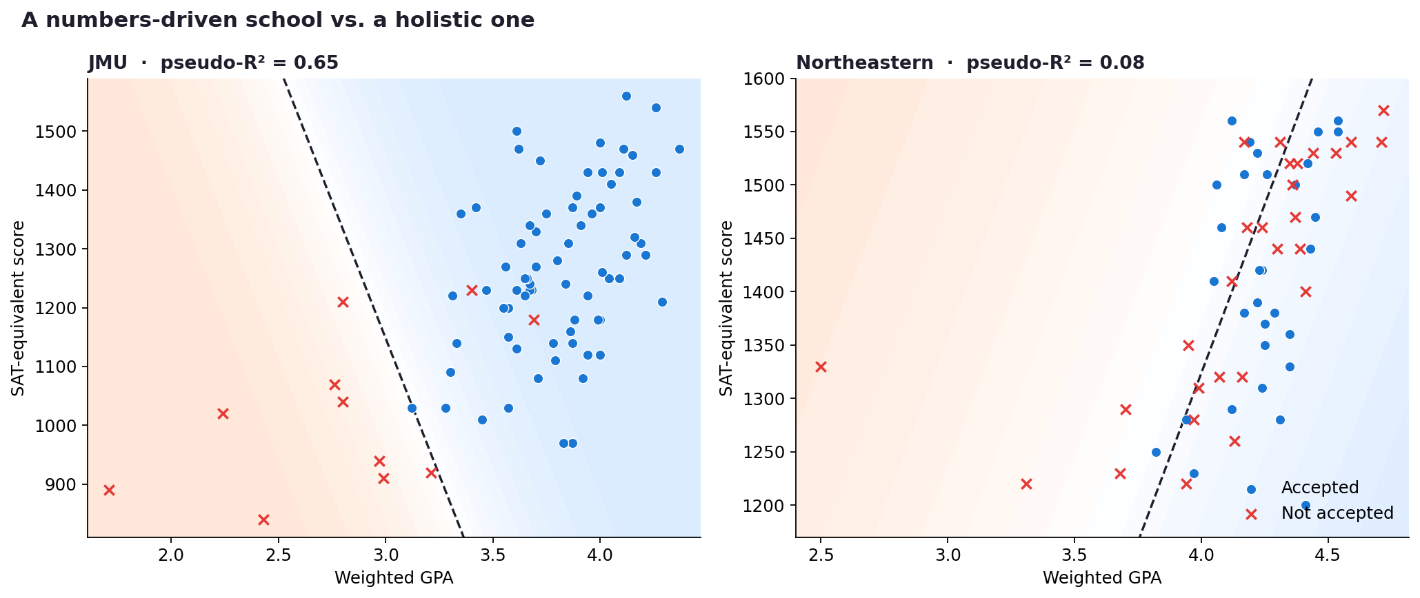
Left: JMU, where the dashed line cleanly separates blue (accepted) from red (denied). Right: Northeastern, where blue and red are scattered all over each other and no line can really separate them. Background shading shows the model’s predicted probability of admission: warm cream means low, cool blue means high.
At JMU on the left, the dashed line does a pretty good job. Most of the blue dots are on one side and most of the red X’s are on the other. At Northeastern on the right, the line gives up. Blue and red dots are mixed together everywhere on the plot. There’s no GPA-and-SAT combo that reliably predicts the outcome.
That visual difference is exactly what the stacked bar chart was measuring, just in a different way. A school where the line cleanly separates the dots has a high share explained by numbers. A school where the line struggles has a low share, and a huge “everything else” residual.
Three patterns the model surfaced
A reminder before this section. These are patterns in three numerical features across roughly 60 to 120 records per school. They aren’t evidence of how the schools actually conduct their review. Treat them as observations about the dataset, not as claims about institutional behavior.
1. Georgetown’s early-application weight is bigger than its test-score weight.
Most schools in this dataset show a tiny weight on decision type. Whether someone applied early or regular barely moves the model’s prediction. Georgetown is the exception. At Georgetown, the “applied early” effect carries about twice the weight of the entire SAT score variable.
This shows up in the data as a strong positive coefficient on the Early indicator. There are plenty of innocent explanations: early pools tend to be smaller, early applicants tend to be a more committed and prepared subset, and so on. My data can’t distinguish between “Georgetown reads early applicants more generously” and “the kind of student who applies early to Georgetown is a stronger applicant in ways the model isn’t measuring.” All I can say is that, in this dataset, the “Early” indicator is statistically heavy.
2. U Miami is the only school where test score outweighs GPA in the model.
At every other school in the dataset, GPA carries more weight than test scores, often by a factor of two or three, sometimes much more. UVA, JMU, William & Mary, even highly residual Northeastern: GPA leads.
U Miami inverts that. The coefficient on test score is about twice as large as the coefficient on GPA. That doesn’t mean U Miami “cares less” about grades. It means that among the applicants in this dataset, whose GPAs already cluster fairly tightly, the test score is the variable that the model finds most useful for separating admits from denies. It’s a reminder that “what predicts admission at school X” depends on who’s applying to it.
3. Northeastern’s test-score coefficient is negative. Yes, negative.
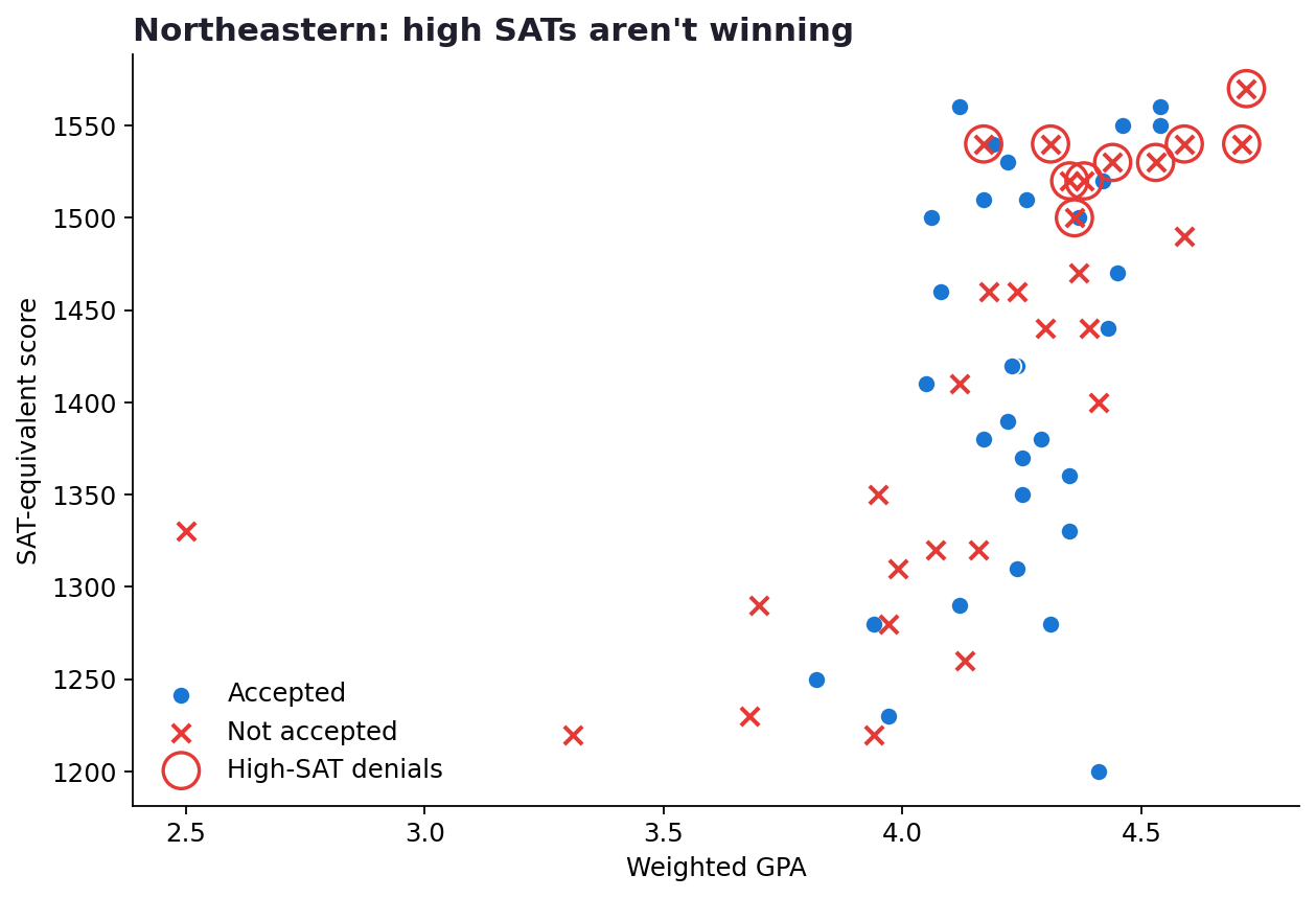
Several Northeastern applicants with SATs of 1500+ were denied or waitlisted. The pattern is consistent with what some college counselors call yield protection, but I want to be clear that this is one possible explanation among several, and the sample here is small.
This is the finding that surprised me most. In a world where higher scores reliably help, the coefficient on test score should be positive. At Northeastern, in this dataset, it’s the opposite. As scores go up, the modeled probability of admission goes down slightly.
One common explanation in admissions discussion forums is something called yield protection: schools modeling how likely each admit is to actually enroll, and being cooler on applicants whose stats suggest the school is a safety. I want to be careful here. A negative coefficient on a small sample can absolutely be noise, and the same pattern could be produced by other dynamics I can’t see (which applicants applied early, what they wrote about, how their teachers described them). The data shows the pattern. The data doesn’t prove the explanation.
4. Virginia Tech’s test-score weight is essentially zero.
Of all the schools where the model fits reasonably well, Virginia Tech weighs SAT/ACT the least. The coefficient on test score is tiny, about 3% of the total weight. GPA matters (about 25%), applying early matters a little (about 5%), and then there’s an enormous 67% residual.
That’s a school that’s officially test-optional and statistically behaving like it in this dataset.
Going deeper: what the model is actually doing
Up to this point I’ve been hand-waving a little. If you’re still with me and you want the actual mechanics, here’s how the “factor weights” in the hero chart are computed.
The logistic regression equation
Logistic regression models the probability of acceptance as a function of the input features:
P(Accepted) = 1 / (1 + e−(b₀ + b₁·GPA + b₂·Score + b₃·Early))
The b values are coefficients. A positive coefficient means that as that feature goes up, the modeled probability of acceptance goes up. A negative coefficient means the opposite. The size of the coefficient tells you how much each unit change in the feature moves the “log-odds” of being admitted.
The model is fit separately for each school, which is why every school gets its own personality. UVA’s coefficients are not Northeastern’s coefficients.
Why I had to standardize the inputs
There’s a problem with comparing coefficients across features directly. GPA in this dataset ranges from roughly 2.4 to 4.7. SAT scores range from 840 to 1600. The Early indicator is 0 or 1. If the model gives GPA a coefficient of 2.5 and SAT a coefficient of 0.003, that doesn’t mean GPA is “more important.” It just means SAT is on a much bigger numerical scale.
To make the coefficients comparable, I standardized every feature using a z-score transformation:
Where μ is the feature’s mean and σ is its standard deviation. After standardization, every feature has mean 0 and standard deviation 1. A coefficient of +2.0 on standardized GPA means the same thing as a coefficient of +2.0 on standardized SAT: a one-standard-deviation increase in that feature shifts the log-odds by 2.0. Now the coefficients can be compared directly, and we can talk meaningfully about which feature “matters more” at each school within the model.
Pseudo-R²: how much can the numbers explain in total?
Linear regression has a familiar measure called R-squared that tells you what fraction of variation the model explains. Logistic regression doesn’t have a direct equivalent because the outcome is binary, not continuous. The closest thing is McFadden’s pseudo-R², defined as:
Where LLmodel is the log-likelihood of the fitted model and LLnull is the log-likelihood of a “null” model that just predicts the base acceptance rate for every applicant. If the fitted model is no better than the null model, the ratio is 1 and pseudo-R² is 0. If the fitted model is much better, the ratio approaches 0 and pseudo-R² approaches 1.
For logistic regression, values between 0.2 and 0.4 are generally considered “good fit” (McFadden’s original guidance). My values ranged from 0.07 (Penn State) to 0.65 (Georgetown and JMU). That spread is itself a finding. It’s the quantitative answer to “how much of admissions in this dataset is predictable from the numbers?” and it’s wildly different from school to school.
The weight distribution: turning coefficients into a bar chart
So how do I get from coefficients to that stacked bar chart? Two steps.
First, the pseudo-R² tells me what fraction of the decision the three measurable factors explain in total. To split that total across the three individual features, I take the absolute value of each standardized coefficient (because I care about magnitude, not direction), then compute each feature’s share of the total coefficient magnitude:
The first part of the formula gives each feature its proportional share of the model’s explanatory power. The multiplication by pseudo-R² scales it down to actual explained variance. So GPA’s weight is “GPA’s share of the coefficient magnitude, scaled to the model’s overall explanatory power.”
Second, the residual (the “Everything Else” block) is just the complement:
By construction, all four weights sum to exactly 1.0 for every school. That’s what makes the stacked bar chart valid. It’s a real decomposition, not a vibe-based pie chart.
Worked example: UVA, end to end
To make this concrete, here’s how UVA’s numbers actually come out. After standardization, the model fits with these coefficients:
| Feature | Coefficient | Absolute Value |
|---|---|---|
| GPA (standardized) | +2.79 | 2.79 |
| Test Score (standardized) | +0.99 | 0.99 |
| Early (standardized) | +0.20 | 0.20 |
| Sum | — | 3.98 |
The pseudo-R² comes out to 0.567, so the model is explaining about 57% of the variation in UVA outcomes. Distributing that across the three features:
And that’s the UVA bar from the hero chart. GPA carries about 40% of the model’s explanatory power, test score about 14%, decision type a barely-significant 3%, and a 43% residual.
Cross-validation: making sure I’m not fooling myself
Any model is going to look good on the data it was trained on. The interesting question is whether it generalizes to data it hasn’t seen. To check that, I used 5-fold cross-validation: split each school’s data into five chunks, train on four of them, test on the fifth, rotate through all five splits, and average the accuracy.
The cross-validated accuracies were:
| School | N | Acceptance Rate | Pseudo-R² | 5-Fold CV Accuracy |
|---|---|---|---|---|
| JMU | 83 | 87% | 0.65 | 93% |
| Georgetown | 30 | 27% | 0.64 | 90% |
| William & Mary | 56 | 54% | 0.57 | 81% |
| UVA | 122 | 45% | 0.57 | 79% |
| Virginia Tech | 117 | 55% | 0.33 | 72% |
| Penn State | 64 | 73% | 0.07 | 64% |
| U Miami | 42 | 50% | 0.14 | 62% |
| Northeastern | 60 | 52% | 0.08 | 55% |
The schools where the model already had high pseudo-R² also generalized well to held-out data, which suggests the patterns are real within this dataset rather than artifacts of overfitting. Northeastern’s 55% cross-validation accuracy on a roughly 50/50 acceptance pool is, again, basically a coin flip. Exactly what you’d expect when the three measurable features aren’t doing much of the work.
The limits of what this can show
This section deserves more weight than it usually gets in posts like this, so I’ll spell it out.
The residual is not pure extracurriculars. I’ve been calling the gray block “Everything Else,” but that’s a residual variance term. It includes everything the three measurable features can’t explain: essays, extracurriculars, recommendations, demonstrated interest, demographic factors, institutional priorities, alumni connections, fit with this year’s incoming class, and pure random variation in admissions decisions. Some of the residual is signal, some of it is noise. The model can’t tell you which is which.
The sample is small and from a single school. Even at the schools where I have over 100 applicants, the data is drawn from one local high school’s graduating classes. Self-selection effects are everywhere. The kind of student who applies to Georgetown from this dataset is not a representative slice of all Georgetown applicants. Some of what looks like “Georgetown loves early applicants” might be “Georgetown loves the kind of student in this dataset who applies early.” A larger, multi-school sample would distinguish those two stories. I don’t have one.
Missing data introduces selection bias. I dropped applicants with missing GPA, missing test scores, or missing decision type. If missingness correlates with outcomes, say if weaker students more often went test-optional, then the model is fit to a slightly biased subset of the data.
Logistic regression assumes a linear relationship between features and log-odds. Real admissions probably has threshold effects. A 3.0 GPA might be roughly equivalent to a 2.9 GPA in terms of admit chances at most schools (both very low), but a 3.9 vs. a 4.0 might be meaningfully different at the top end. Logistic regression approximates that, but it doesn’t model it perfectly.
And finally: correlation isn’t causation. A high GPA weight at UVA doesn’t prove that UVA “decides” based on GPA. GPA correlates with admissions, but GPA also correlates with all kinds of unmeasured strengths that admissions readers might actually be responding to. The weights tell you what predicts admission in this dataset, not what causes it.
Try it yourself
Plug in a profile below and see the model’s predicted acceptance probability at each of the eight schools. The bars are computed in real time from the actual fitted coefficients. Move the sliders and watch the predictions update.
“Please read this before you start sliding. The simulator is purely a number-based model on a small sample of one school’s applicants. The percentages it shows are not your real chances of getting into any of these schools. A low number here does not mean you can’t get in. A high number here does not mean you will. Real admissions decisions depend on essays, recommendations, extracurriculars, interviews, demonstrated interest, and dozens of factors this model cannot see. Use this as a way to explore how three features interact, not as a tool to set your expectations or rule out a school you’re excited about.”
Henry's Interactive Admissions Simulator
All probabilities are computed from logistic regression coefficients fit on the same dataset described in this post. "No test" uses the school’s mean score for that feature, which is a rough way of saying "I’m not submitting; judge me on GPA." The model still has the same limitations described above.
What I actually learned
The numbers are interesting, but here’s the thing I didn’t expect.
I started this project thinking I’d figure out the “real” rules of admissions. I’d crack the code, find the formula, and walk away with a strategy. What I actually found was that for half the schools in this dataset, there is no formula. At least not one that lives in GPA, SAT, and decision type. At Penn State, Northeastern, and U Miami, more than 80% of what determines an outcome is invisible to the kind of data colleges report and high schools track.
That’s either alarming or freeing, depending on how you look at it. I think it’s freeing. If the model had learned that admissions was 95% GPA and SAT, the message would be pretty bleak: get the numbers or get nothing. What the model actually shows is that numbers explain part of the story at some schools, very little of the story at others, and that the unmeasured majority (the part admissions officers are presumably reading for) really is doing most of the work at the schools that say they conduct holistic review.
That’s not a strategy. But it’s a better mental model than I had before I built this, and an honest one: the headline finding of a quantitative analysis of admissions is that admissions isn’t very quantitative.